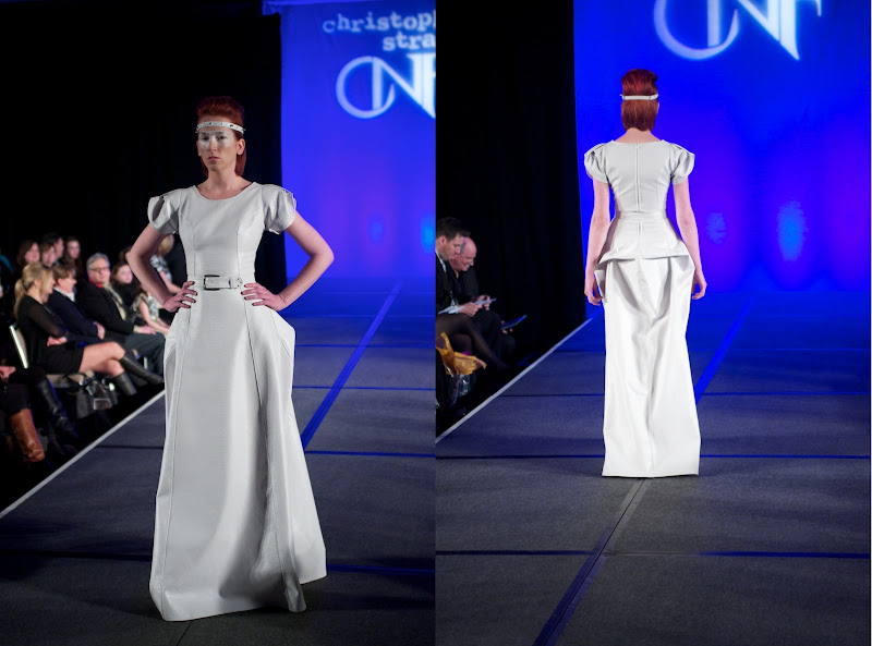
 Straub's 21-look line was, by all accounts, Straub's most sophisticated and focused collection to date, full of colorful prints - the designer's own designs - structured designs, and fluid silhouettes, showing the designer moving into a slightly edgier direction. Though making a few cameo appearances in his handbags, his signature "petals" were otherwise absent, replaced by a trio of spikey, black patent leather looks that seemed at odds with the rest of the otherwise cohesive collection. Straub's digital prints - though clearly influenced by Alexander McQueen's "Plato's Atlantis" from Spring 2010 - added a welcome shot of color and texture into the proceedings, most successfully in a black-and-white print tailored jacket and a floor-length gown. His draped, one-shoulder swirl-print dress offered an understated chicness, as did a flippy little dress with flounced sleeves. For the most part, he worked well with a stiff, white snakeskin print fabric, particularly in a safari-like jacket, ruffle-front top and the evening's wow moment, a full-length gown. The designer also made a small but welcome foray in knits.
At times, though, Straub struggled with proportion - a nearly gynecological ruffled skirt was paired with a barely-there one-shouldered top - and relied too heavily on the prints to hold up an otherwise basic design. Straub also tends to struggle with styling, as in his pairing of tailored jackets with leggings, brings down the sophistication level a few notches, as well as fabric selection, which too often look inexpensive. Overall, though, there was a lot to like here - some well-tailored basics-with-a-twist coupled with a few bold moments that showed Straub pushing himself forward as a designer.


[Review originally published in Vita.mn. Images by Kevin Ophoven]
More reviews: Click here for a review by Beth Hammarlund for l'étoile with photos by Peter Holme Photography. Click here for a review and photos by Mary O'Regan of METRO Magazine.

Any way to enlarge the individual photos themselves, not as a group?
ReplyDeleteThis comment has been removed by the author.
ReplyDeleteEnlarged photos have been added!
ReplyDeleteGreat review, Jahna! I have some behind the scenes photos on my blog, if you're interested!
ReplyDeletehttp://greeneyemusings.blogspot.com/